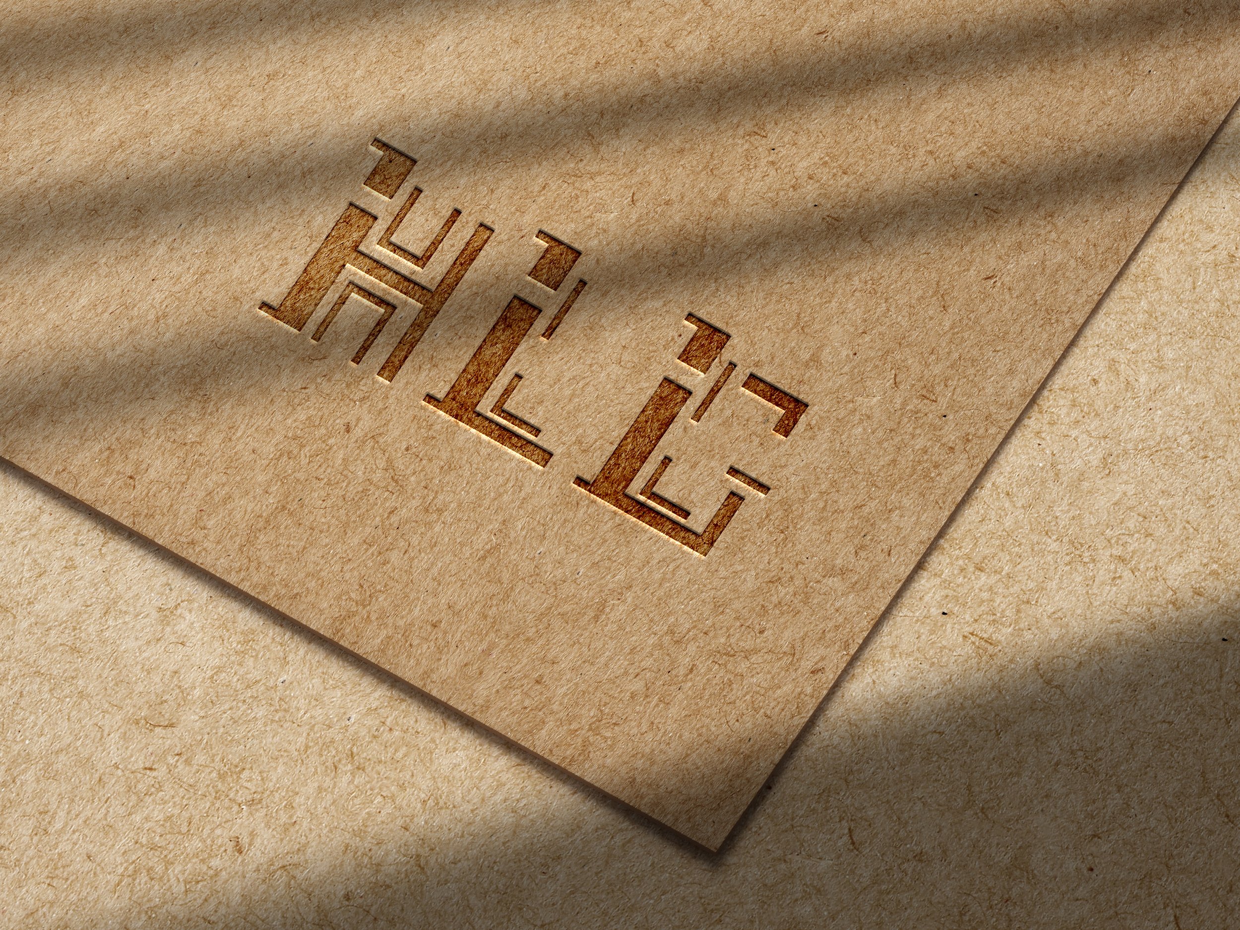
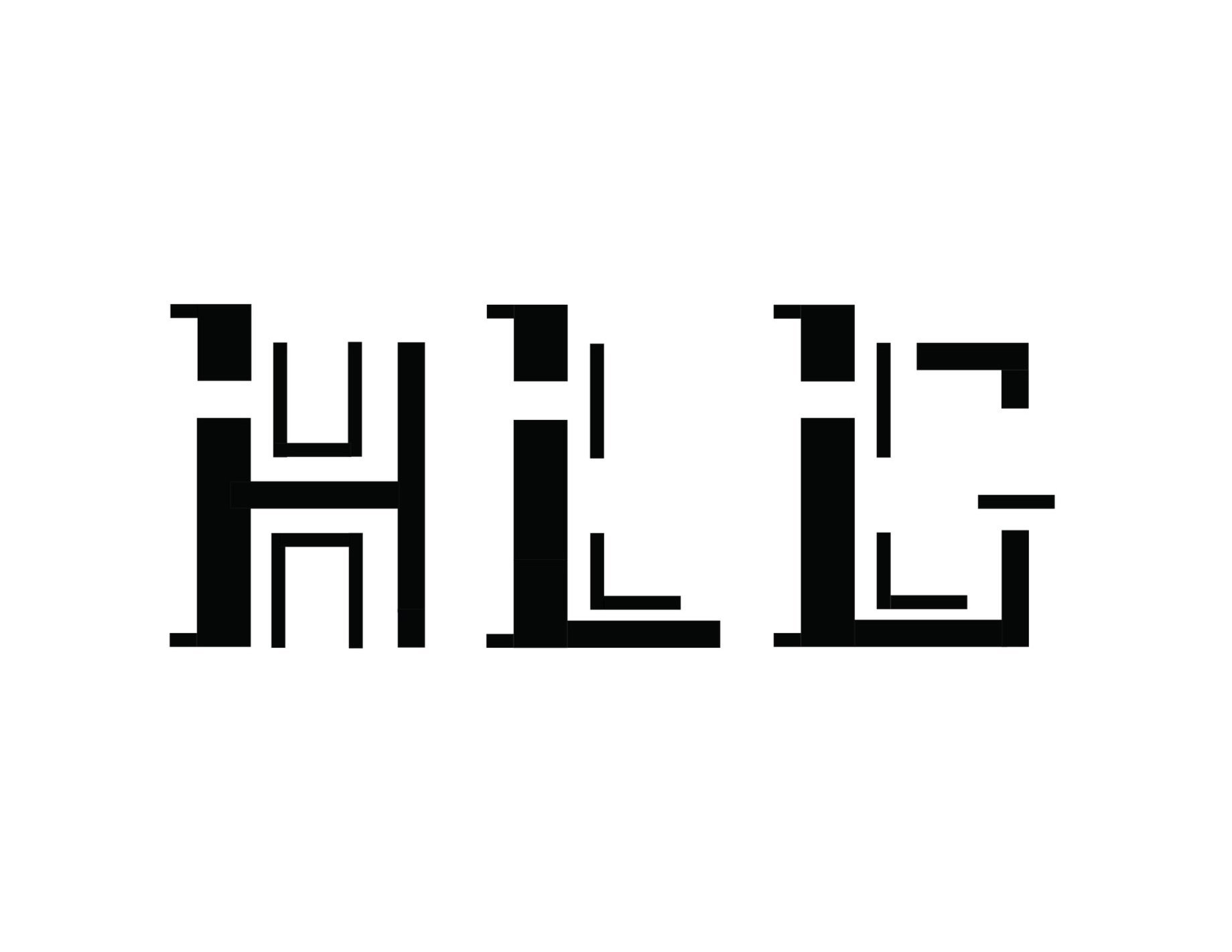
bitmap monogram

In creating this modular typeface, I embraced a distinctive approach by introducing serifs exclusively on the left side of each letter. This emphasis is underscored by a bold line weight, while ensuring consistency in line weights across all letterforms. To enhance depth and dimension, I integrated thinner stroke outlines within the letterforms. Through design iterations and digital refinement, I achieved a fusion of these elements, resulting in a unified monogram.
Before
*Fall 2023 GDSN223 Submission
In refining my initial submission, my focus was on elevating the coherence and clarity of the typeface system. With simplification being a central focus, I consolidated the design around a sturdy baseline and consistent x-height for the letterforms. Notably, I streamlined the visual presentation by exclusively utilizing bold left-side strokes of each letterform as ascenders, ensuring both consistency and visual balance. Variations in line weights were minimized to refine uniformity and legibility. I standardized cutouts to reside exclusively on the left stem of each letterform, enhancing the unification. By eliminating unnecessary descenders from the original submission, I achieved a more polished monogram, underpinned by a consistent design capable of rendering any letter of the alphabet in this typeface.
after
*Spring 2024 Revised Version


